
The Silent Dialogue of Built Worlds
Before an actor speaks, the audience has already begun reading the room. A narrow hallway can suggest entrapment, a towering ceiling can make a character appear diminished, and a carefully placed family photograph can reveal a history no screenplay needs to explain aloud. Cinema communicates through space first, often so quietly that viewers absorb the message before they consciously recognize it.
That silent communication is the work of production design. The production designer acts as the film”s primary visual psychologist, translating character, genre, period, and conflict into architecture, objects, surfaces, and color. As the American Film Institute explains, production designers lead the art department and transform scripts into visual worlds. Their decisions create the emotional stakes before the first line lands. Spatial design establishes power, tactile textures imply lived experience, and curated palettes guide the audience toward a film”s deepest subtext.
Architecture as Psychology and Emotional Geometry
Architecture is never neutral on screen. Ceiling height, doorway size, corridor width, and the relationship between public and private rooms all influence how viewers understand a character”s position in the world. A low ceiling can press down on a family argument, while a vast room can make a solitary figure look exposed. Even an apparently ordinary kitchen may become a diagram of authority if one character occupies the central island and another remains stranded near the edge of the frame.
This is why production design combines art, architecture, and narrative rather than simply making a location look attractive. In Moonrise Kingdom, art director Gerald Sullivan described the deliberate contrast between Camp Ivanhoe and Fort Lebanon. The environments differ in scale and density, giving each space its own social logic. Camp life feels organized, populated, and controlled, while other locations create a stronger sense of isolation or discovery. The architecture helps the audience understand where rules operate and where young characters imagine escape.
Expansive sets and claustrophobic interiors produce opposite psychological pressures. Open landscapes, oversized rooms, and unobstructed sightlines can suggest freedom, but they can also expose vulnerability. Tight rooms, crowded furniture, and compressed corridors may represent anxiety, secrecy, or a mind closing in on itself. Architectural lines sharpen these effects by directing the eye. Staircases pull attention upward or downward, windows frame unreachable possibilities, and converging walls funnel the audience toward a face, object, or threat.
- Height can communicate dominance, insignificance, aspiration, or oppression.
- Width can create social distance or make conflict feel unavoidable.
- Symmetry may suggest order, ritual, or a system that leaves no room for individuality.
- Obstructions such as doorframes, railings, and partitions can imply surveillance, secrecy, or emotional barriers.
- Depth allows the foreground and background to compete, revealing divided loyalties or parallel lives.
Decoding Clutter, Texture, and Character Archaeology
Set decoration turns a location into evidence. Bare architecture tells viewers where a story happens, but the objects inside it suggest who has endured, worked, lied, loved, or failed there. A drawer filled with expired receipts, a repaired chair, a child”s drawing beneath a newer coat of paint, or a stack of unopened mail can create a biography without exposition. These details are forms of character archaeology, fragments excavated from an imagined past.
Materials carry social and psychological information as well. Polished chrome reflects wealth, maintenance, and an aspiration toward modernity, although it may also feel cold or emotionally sterile. Peeling wallpaper records neglect, financial pressure, or a household trapped in an earlier era. Worn wood can suggest continuity and resilience, while glossy synthetic surfaces may imply artificiality. The most effective sets rarely rely on one obvious symbol. Instead, they layer contradictions, allowing a character to live among expensive objects that are poorly maintained, or humble furnishings that are arranged with obsessive precision.
Set decorators work closely with production designers, prop masters, directors, and performers to make this history legible without making it conspicuous. The podcast Decorating Pages, hosted by Emmy-winning set decorator Kim Wannop, highlights how design teams construct television worlds through research, period accuracy, character development, and logistical problem-solving. Jane Barnwell similarly identifies space, light, color, and set decoration as practical tools of visual storytelling. For students and emerging filmmakers, the lesson is direct: background dressing is not filler. It is behavioral information.
- Ask what the character keeps. Collections, duplicates, souvenirs, and discarded possessions reveal desire, fear, nostalgia, or denial.
- Look for signs of maintenance. Repairs, stains, polish, and dust indicate whether the character controls the space or has surrendered to it.
- Separate public and private objects. A formal living room may present an idealized identity, while a bedroom exposes the less edited version.
- Build contradictions. A disciplined character may have one chaotic drawer, or a seemingly careless person may protect a single immaculate object.
- Give objects a timeline. New purchases beside inherited furniture can show transition, grief, ambition, or financial strain.
The Subconscious Weight of Curated Color Palettes
Color can establish a film”s emotional grammar before plot details become clear. A palette may begin with a dominant hue, then shift gradually as a character”s circumstances change. Warm amber can promise comfort while quietly suggesting decay; blue can signal logic, loneliness, or emotional distance; red can represent desire, danger, shame, or vitality. Meaning depends on context, repetition, contrast, and the audience”s relationship with the world on screen.
Stylized chromatic control is particularly powerful in films that announce their artificiality. Wes Anderson”s pastel worlds, for example, use coordinated costumes, walls, props, and landscapes to create a heightened emotional universe. The colors feel whimsical, but their precision can also reveal characters trapped inside rituals and systems. At the other extreme, harsh desaturated naturalism drains the frame of decorative comfort. Gray skies, faded interiors, and weak skin tones can make social conditions feel inescapable. Neither approach is automatically more truthful. Each establishes a different contract with the viewer.
Color also works through rhythm. A recurring yellow object may become a visual refrain, while a character who begins in pale tones may acquire stronger color as confidence grows. In the stage production discussed by the New York Theater review of Color Theories, red, blue, and yellow are associated with passion, logic, and joy, while combinations generate more complex ideas. The production ultimately questions the rigidity of those classifications, a useful reminder that color theory can guide interpretation without dictating a single meaning.
| Tonal palette | Common visual effect | Psychological states it may evoke |
|---|---|---|
| Pastel pinks, yellows, and mint greens | Whimsy, nostalgia, heightened artificiality | Longing, playfulness, emotional repression |
| Deep reds and amber | Heat, intimacy, danger, theatrical intensity | Desire, jealousy, urgency, obsession |
| Cool blues and blue-gray | Distance, stillness, nocturnal unease | Isolation, thoughtfulness, grief, control |
| Desaturated earth tones | Naturalism, exhaustion, social realism | Resignation, hardship, emotional depletion |
| High-contrast black and white | Graphic separation and moral or thematic emphasis | Conflict, memory, idealism, fatalism |
Collaborative Worldbuilding from Concept Art to Set Dressing
A finished set may look inevitable, but it usually begins as a sequence of uncertain questions. Production designers read the script, identify locations and visual motifs, research historical or cultural references, and produce thumbnails, key frames, floor plans, models, and concept art. Those early images establish the world”s proportions and visual promises. From there, art directors translate ideas into schedules, budgets, construction plans, locations, and materials. The process is both imaginative and intensely practical.
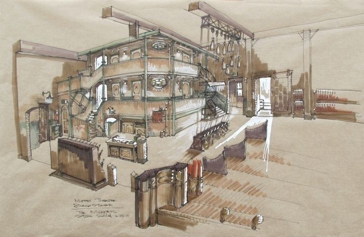
The work remains collaborative from the first sketch to the final adjustment on set. In animation, Marcin Jakubowski”s work as co-production designer on Klaus involved establishing a visual language and coordinating across departments so characters, lighting, and environments remained coherent. His development of the film”s 2D shading system added shadows, bounced light, ambient light, and skin translucency, making the characters feel integrated into their world. Live-action productions face a comparable challenge: the set decorator, cinematographer, costume designer, visual-effects team, and director must ensure that every visual choice belongs to the same emotional universe.
- Concept artists explore the world”s shape, atmosphere, palette, and visual identity.
- Production designers connect those ideas to the script, locations, construction, budget, and overall design strategy.
- Art directors manage execution, coordination, scheduling, and practical adaptation under production pressure.
- Set decorators populate environments with objects, fabrics, surfaces, and evidence of character history.
- Cinematographers shape how the finished spaces are seen through light, lenses, framing, movement, and exposure.
Visual continuity becomes even more important in non-linear or fantastical stories. A recurring texture, architectural shape, or color can connect scenes separated by decades, dreams, flashbacks, or alternate realities. The audience may not consciously identify the pattern, but it helps the story feel emotionally continuous. In a carefully designed fantasy world, the same visual rules can make impossible events feel credible. In a fragmented drama, a repeated object can function as a bridge between different versions of a character”s memory.
Learning to Read the Language of Cinematic Space
Architecture, texture, and color operate together as cinema”s invisible script. Architecture establishes pressure and possibility. Texture records the passage of time and the condition of a life. Color tunes the audience”s emotional response, sometimes announcing a theme and sometimes contradicting what a character says. When these elements align, the result can feel effortless, yet that apparent ease reflects hundreds of decisions made before the camera rolls.
On a first viewing, try reading the environment before interpreting the dialogue. Notice who occupies the center of a room, which objects remain untouched, where the light falls, and whether the palette warms or cools when a relationship changes. That simple checklist can transform passive watching into active visual analysis. The greatest storytellers do more than place characters inside attractive settings. They construct worlds with their own memory, pressure, and point of view, worlds that speak before anyone utters a word.